Óasis Coffee Shop Website
Read time:
4 min
Client:
Pastelaria Oásis
Industry:
Food Retail
Start:
End:
Duration:
5 Weeks
This project was developed as part of the Google UX Design certification, focusing on designing a mobile ordering experience for Pastelaria Oásis, a local bakery. The goal was to explore how UX research, prototyping, and user‑centered design principles could reduce in‑store waiting times and improve the convenience of ordering bakery products.
Throughout the project, I conducted user research, created personas, mapped user journeys, and designed both low‑fidelity and high‑fidelity prototypes. The mobile app concept allows customers to browse familiar products, customize items, schedule pick‑ups, and avoid queues during peak hours. Although a functional website prototype was completed on February 28, 2026, it was not released publicly and remains a design exploration intended for academic evaluation and portfolio presentation.
The project demonstrates my ability to translate user needs into clear design decisions, build accessible interfaces, and create efficient ordering flows for different user profiles—from routine‑driven local customers to busy professionals. It highlights the full UX process from problem definition to prototyping, showcasing practical skills developed during the Google UX Design program.

Starting point
The project began by identifying a recurring problem for local customers at Pastelaria Oásis: long queues during peak hours and a lack of simple digital alternatives. Marta, a frequent customer, often avoided ordering because the waiting time disrupted her morning routine. This insight became the foundation for designing a mobile solution that would make ordering faster, clearer, and more convenient.

Problem solving
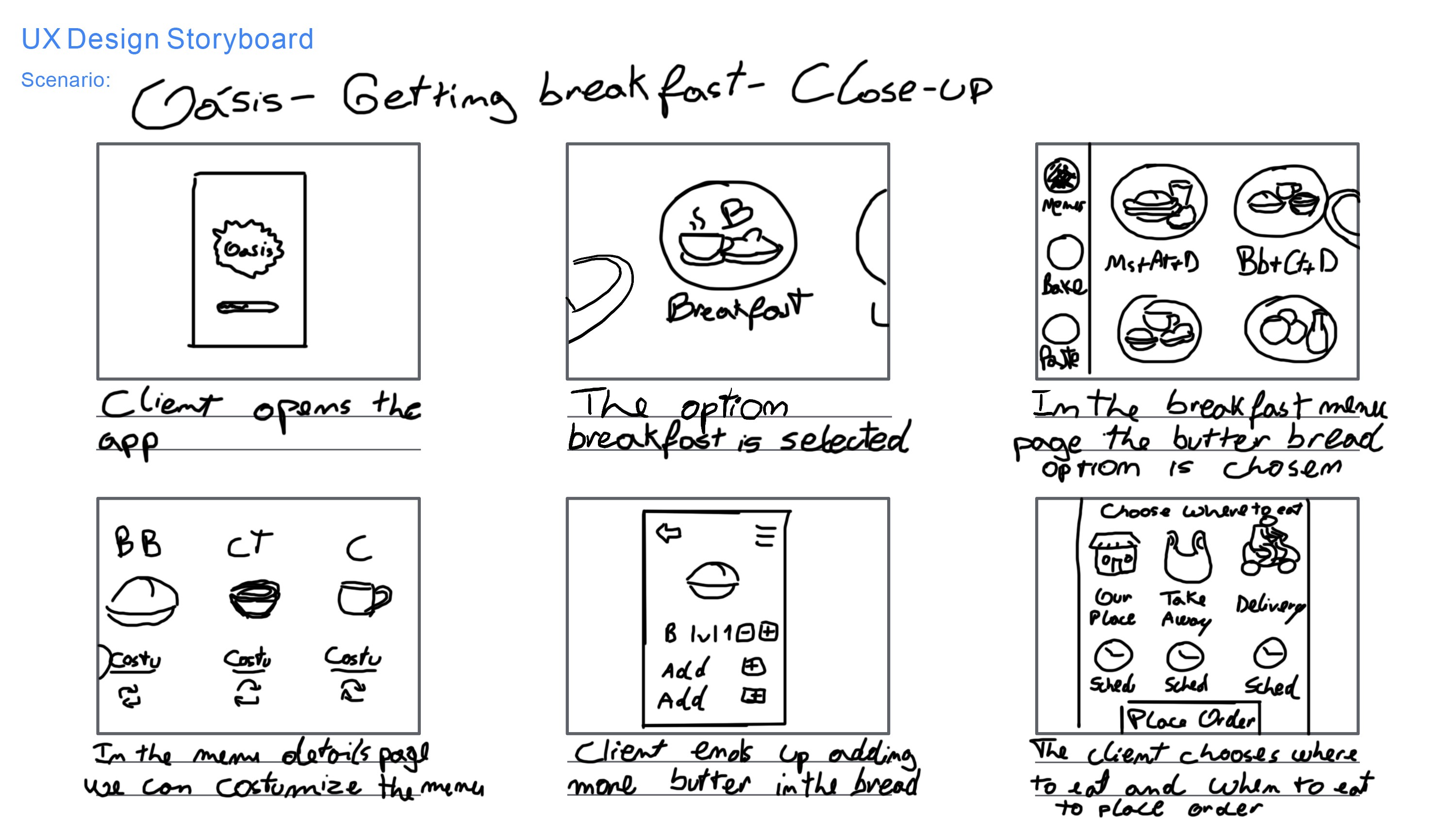
After identifying that customers struggled with long queues and complex ordering processes, the design phase focused on creating a faster and more intuitive mobile experience. The solution began by simplifying the ordering flow: users can open the app, quickly find familiar items, customize their choices, and schedule pick‑up without navigating unnecessary steps.
This approach directly addresses the needs of both personas. Marta, who values clarity and routine, and Paulo, who requires speed and efficiency. By reducing cognitive load and minimizing interaction steps, the prototype transforms a stressful in‑store experience into a streamlined digital process.
Implimentation
After defining the user needs and outlining the solution, the next step was to translate the concept into a functional interface. The implementation phase focused on building a clear and efficient ordering flow, starting with low‑fidelity wireframes and evolving into high‑fidelity screens.
The menu structure, product categories, customization options, and scheduling features were designed to reduce cognitive load and support fast decision‑making. Each screen reflects the core UX goals: simplicity for routine‑driven customers like Marta, and speed for busy professionals like Paulo.
The final prototype demonstrates how research insights were transformed into a cohesive digital experience, ready for usability testing and academic evaluation within the Google UX Design program.

Results
The final prototype demonstrates how user research and UX principles were translated into a functional digital experience. The high‑fidelity screens show a clear and accessible ordering flow, allowing customers to browse familiar products, customize items, and schedule pick‑ups without waiting in line.
The interface reflects the needs of both personas: simple navigation and legible text for routine‑driven customers like Marta, and fast, minimal‑step interactions for busy professionals like Paulo. Although the website was not released publicly, the prototype successfully fulfills the academic goals of the Google UX Design program and showcases a complete end‑to‑end solution ready for usability testing and future development.